Lafayette CollegeTechnology Help
Creating Accessible PowerPoint Presentations
How to create accessible PowerPoint Presentations
The following information is meant to help in the creation of accessible PowerPoint presentations so that the content is available to all users. PowerPoint presentations tend to be very visual, so for those with low vision or using screen readers, accessibility is key. Many of the concepts covered here can also be found in Creating Accessible Word Documents.
Presentation Design
- Using a larger font size will help those with low vision or certain learning disabilities see the text. 28-point font or larger is recommended.
- Try to reduce the reading load by keeping the slides simple and to the point. Following the “six by six” rule, which is no more than six words across and six lines down, allows for information to be more effectively conveyed to all users.
- The “Office Theme” is an accessible slide design created with accessible colors, contrasts, and fonts, and allows screen readers to more easily read slide content. Themes can be selected in the Design tab in the ribbon.

- Use the pre-defined slide layouts provided in the selected theme. These layouts ensure the content is accessible to those using assistive technology, even if converted to HTML or PDF.
Slide Titles
Slide titles act as a way to navigate through the presentation using a screen reader and also provide information about the content of each slide. Slide titles should each be unique and specific to each given slide. If you want a title to be invisible on a slide but still voiced by the screen reader, do the following:
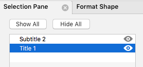
- On the Home tab in the ribbon, select the [Arrange] button and choose Selection Pane.
- In the Selection Pane, click the eye icon beside each title to hide or reveal it.

Reading Order
Screen readers read through the content on a slide in a certain order, including the title, text, and alt text. To ensure the slide contents are read in the order intended, set the reading order by doing the following:
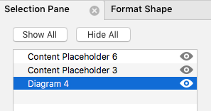
- On the Home tab in the ribbon, select the [Arrange] button, then choose Selection Pane.
- The Selection Pane lists the objects on the slide in reverse order, meaning a screen reader will read the content beginning with the last list item and ending with the first list item.
- To change the reading order, drag the items to the desired order.

Presentation Content
Text Boxes
Avoid using text boxes that are not part of the native slide layout, as they appear as graphic elements to screen readers and the content may be inaccessible. This is true if the slides are converted to HTML or PDF as well.
Visuals
Adding alt text to all visual elements in a presentation allows those using screen readers to understand and access the content more readily and effectively. Decorative elements do not need to contain alt text, but any visual element containing content relevant to the presentation should. Alt text should, when possible, be short and to the point.
Adding Alt Text to Images
Best practices for adding alt text to images are the same as for Word Documents.
Adding Alt Text to SmartArt
- Click on the SmartArt graphic.
- Select the Format tab in the SmartArt Design pane.
- Click the [Alt Text] button from the ribbon.
- Type in the description in the Alt Text box.
- Repeat for each SmartArt graphic.
Adding Alt Text to Shapes, Charts, or Tables
The steps for adding alt text to shapes, charts, or tables are the same as above for SmartArt.
Audio and Video
To make audio and video resources accessible, make sure there are captions provided with the media, and if possible, a transcript as well.
Tables and Lists
Best practices for creating tables and lists are the same as for Word Documents.
Accessibility Checker
The steps for using the Accessibility Checker are the same as for Word Documents.