Lafayette CollegeTechnology Help
Creating Accessible Word Documents
How to Create accessible word documents
The following information is intended to help maximize the accessibility of Word documents for readers using assistive technology software such as screen readers. These best practices will also help produce documents that are better for all readers and will allow for successful conversion to accessible PDF files.
Document Layout
- Format documents with high contrast such as black text on a white background to provide higher readability to those with low vision.
- Ensure the font size is sufficiently large, generally a minimum of 12 points is recommended.
Document Structure
Headings
A uniform, consistent heading structure is one of the most important accessibility considerations in Word documents. Sighted users often have little difficulty scrolling a lengthy document looking for big, bold text to quickly understand the basic structure and content of the document. Those using screen readers and other assistive technology, however, rely on heading structures (heading styles) for navigation. Headings are more than just using bolded, enlarged, or centered text; they are structural elements that have meaning to a screen reader providing a meaningful sequence to users of assistive technology.
Heading styles allow for the creation of structure through hierarchy. Heading styles start with Heading 1 and progress through Heading 6. Heading 1 is usually the page title or main content heading announcing the overall theme of the document. There should only be one of these per document. Heading 2 is usually a major section heading announcing the main topics covered in the document. All Headings beyond Heading 2 become sub-sections of the heading preceding it. Headings should always progress sequentially and should not skip levels.
An example of good document structure:
- Heading 1
- Heading 2
- Heading 3
- Heading 3
- Heading 2
- Heading 3
- Heading 4
- Heading 3
- Heading 4
- Heading 5
- Heading 4
- Heading 3
- Heading 2
- Heading 2
Notice Heading 3 always comes after Heading 2 and Heading 4 always comes after Heading 3 and so forth. You can have as many headings as you would like as long as the structure remains consistent.
To add headings to the document:
- Highlight the text to be made into a heading.
- Select the appropriate heading from the choices provided in the ribbon or open the Styles Pane for more options.
- To modify the heading style, click the far right paragraph
 button and select “Modify Style.” The font, color, and size can all be customized.
 - Repeat for each heading in your document.
Table of Contents
In addition to allowing for easy navigation of your document by all users, applying headings allows for the quick and easy addition of a table of contents. A table of contents gives those using a screen reader the ability to navigate quickly through a document and to find relevant chapters and sections.
To add a table of contents:
- Place the cursor at the desired location for the table of contents (e.g., the beginning of the document).
- Go to the References tab in the ribbon.
- Click “Table of Contents” and choose the desired style.
- The table of contents will display the heading levels and their relationships allowing users to jump to a desired section of the document by clicking the title or heading.

- It is also a good idea to add page numbers to the document to complement the table of contents. To do so, choose “Page Number” from the Insert tab on the ribbon.
List Formatting
Using bulleted, numbered, or multilevel list formatting allows screen readers to properly announce the text as being part of a list. It also allows users to quickly navigate among items on a list as well as in and out of lists. When lists are made using the tab key or spacebar, screen readers do not recognize the items as being a list, rendering the list reading controls inoperative. Use the list options in the ribbon to choose Unordered Lists, Bulleted Lists, Multilevel Lists or to increase or decrease indents.
![]()
Document Content
Graphics and Images
When it comes to images and graphics, simplicity is key. A simple, well-designed page is easier for all users to read and understand. To accommodate all users, be sure to convey information in the text about any graphic elements in the document such as images, diagrams, charts, graphics, etc. The addition of “alt text” to graphics and images also allows screen readers to describe the content to users. The use of alt text and descriptive text ensures all users can understand the significance of included graphics and images in a document.
To add alt text:
- Select the image to which you want to add text and right-click or Control-click
- Select Edit Alt Text…
- Type the desired text in the “Description” field; a Title can also be added here. The alt text should be succinct and equivalent to the image. There is no need to use descriptive phrases such as “image of…” because the screen reader will identify it as an image for the user. It is recommended to keep alt text to 125 characters or fewer as most screen readers break text up into blocks of 125 characters. For especially complex charts or equations, a link to an extended text description should be used.
Tables
Sighted users visually scan a table to make associations between the data in the table and how it relates to the row or column it is housed in. Screen readers need further assistance to make these same kinds of associations. Accessible tables require a clear table structure and table headers to help guide the screen reader user.
Creating tables:
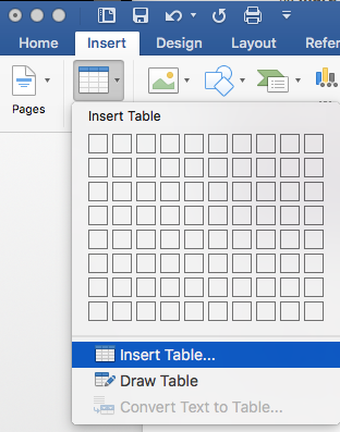
- Select the Insert tab on the ribbon, then select Table > Insert Table.

- To add table headers to the first row, select the Layout tab on the ribbon, then choose Repeat Header Rows.

Links
To create hyperlinks that are accessible to screen readers, use the following principles:
- Use descriptive text when creating the link not just the URL.
- Keep the text brief.
- Avoid using “click here” as screen readers navigate through a document from link to link and ambiguous text makes it difficult for the user to determine the context and relevance of the link.
Accessibility Checker
Word includes an accessibility resource that helps to identify accessibility issues. To check the accessibility of a document, select the Review tab from the Ribbon and then Check Accessibility. An Accessibility Checker task pane will appear to the right with the inspection results.

The Inspection Results classifies accessibility issues into three categories:
- Errors: content that makes a document very difficult or impossible to access. Example: an image with no alt text
- Warnings: content that in most cases makes the document difficult to access. Example: a link with text that is not description such as “click here”
- Tips: content that is accessible, but could be better organized or presented. Example: skipping heading levels such as going from Heading 1 to Heading 3 without using Heading 2
Converting a Word Document to a PDF
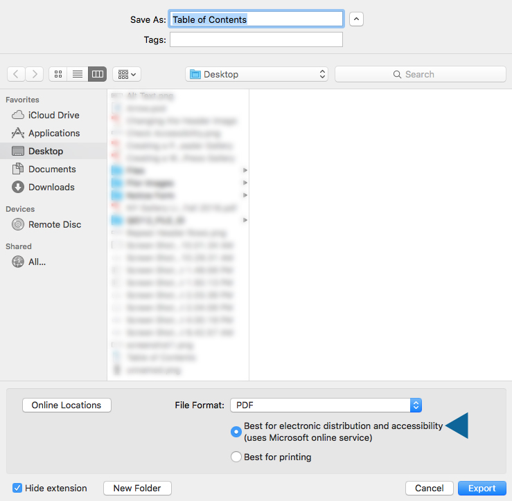
To maintain accessibility when saving a document to a PDF, check the “Best for electronic distribution and accessibility” box when exporting as a PDF.
