There are upwards of 20 In-Content Callouts that can be used. Learn when and how to use the most popular callouts.

how to use in-content callouts
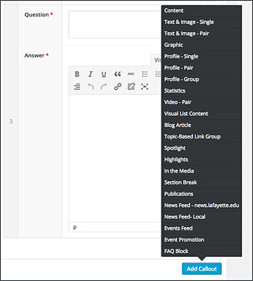
In-Content Callouts contain the majority of page components. To choose a component for your page, simply click on the blue “Add Content” button at the bottom of the In-Content Callouts section and pick a callout type from the pop-up menu. Each callout consists of multiple fields that you will fill in with your information and images. Most callouts allow a choice of color themes.
For more in-depth descriptions of every in-content callout, along with other page components available, see the Style Guide. You may also view this PDF if you’d like to take a look at the WordPress admin area of each component.
Tips for Using In-Content Callouts
- Any field with a red * next to it is a required field.
- Image blocks have a minimum size indicated next to the image block. Any image smaller than the minimum size will result in an error message in the media library. All images need to be 72 DPI.
- When inputting URLs into any component, always make sure to include https//www. into the beginning of the URL. Otherwise, WordPress will not be able to link to your URL.
Visual List Content
A great way to highlight and direct traffic to different pages on your website.
Learn More
Spotlights, Highlights, and Profiles
Spotlights, highlights and profile components can be used to highlight individuals, locations, programs, or events.
Learn More
Topic-based Link Group
This component can be used when grouping many different links to resource pages or other websites under a single topic.
Learn More


