Lafayette CollegeTechnology Help
Testing my WordPress Site on Mobile
Using the Emmet Re:view Chrome Extension
The Re:view extension for Chrome allows you to easily view and test your WordPress site for mobile. Verifying that your website responds to a mobile or tablet format in a user-friendly way ensures that users have a good experience navigating your site, regardless of what device they are using. Responsive websites also benefit those who may be using assistive technology, such as a screen reader, to view your site.
Steps for Installing the Re:view plugin
- From a Chrome browser, go to the Re:view extension page
- Click [Add to Chrome] and confirm “Add extension” when prompted
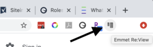
- Once installed, you will see the icon for the extension in your Chrome menu bar
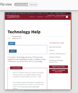
- Navigate to a page you want to test with the extension and click the Re:view button in the menu bar
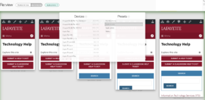
- The “Breakpoints View” allows you to expand and contract the width of your webpage to see what the ‘breakpoints’ are – this is the width at which the layout of the page changes (e.g. the menu collapses into a hamburger or content is reordered)
- The “Device Wall” option allows you to preview your webpage on various devices, such as different models of iPhones or Android devices
If your content does not function as intended, a reorganization of the page or content is probably in order. You may also encounter things like text that takes a long time to scroll through when viewing on a mobile device. Anticipating how your audience is interacting with your website (e.g. mobile device or tablet) can prompt you to organize and design your content with your audience in mind.